Why most performance metrics create bias (and how to spot it)
From Vibes to Evidence: Rethinking Metrics Before They Damage Your Team.


The hidden bias inside performance reviews
Performance review cycles exist for a good reason: at scale, you need a repeatable way to recognize impact, spot growth areas, and make compensation and promotion decisions that feel consistent.
But even with the best intentions, it’s not a perfect mechanism. Bias often comes from the system itself, not from bad actors. Two quick anecdotes illustrate it.
In one case, a newly trained manager inherited a team with a few exceptional senior engineers — and, in the same cycle, an entry-level engineer who needed more guidance which is normal in fast-growing orgs. Without anyone intending it, the senior bar became the only bar. The junior wasn’t evaluated against expectations for their level, but against people ten years ahead. Good intent, biased outcome.
In a different case, a highly experienced engineer became the go-to person when projects were going sideways. He reduced risk, unblocked decisions, aligned stakeholders, and made other engineers effective. His impact was real — but it wasn’t consistently “owned” in the performance narrative due to unstable management and weak sponsorship. In calibration, what isn’t legible often doesn’t count.
This is why I’m cautious with performance metrics: most of them measure proxies (activity, visibility, or story strength), not performance. In engineering, those proxies don’t just break, they fail in predictable ways, and bias is the result.
In this article, I’ll break down the mechanisms behind that bias, the most common metric traps, and a simple checklist to spot misuse before it damages your review cycle.
The three ways metrics distort performance
Most metric harm in performance reviews comes from three predictable mechanisms. They show up even in well-run orgs, with good managers and good intentions.
1) Proxy collapse (the metric becomes the goal)
Performance is multi-dimensional: impact, quality, reliability, collaboration, judgment, and growth. Metrics can’t capture all of that, so we use proxies.
The moment you treat the proxy as “performance,” two things happen:
people optimize the number instead of the outcome,
and the system starts rewarding what’s easy to measure, not what’s valuable.
Classic examples:
PR count becomes “output,” so work gets split, shallow changes increase, and review quality drops.
Tickets closed becomes “execution,” so teams avoid hard problems and underinvest in risk reduction.
This is not a moral failure. It’s a predictable response to incentives.
2) Visibility distortion (what’s seen gets rewarded)

Some work is naturally visible: feature delivery, big launches, high-traffic incidents, “hero moments,” demo days. Other work is essential but quieter: mentoring, design reviews, refactors, de-risking, cross-team alignment, and preventing incidents that never happen.
When visibility becomes a performance proxy:
the loud work wins,
the quiet work gets discounted,
and “hard contexts” (risky projects, struggling teams) become a career penalty.
Certain profiles - often the people doing the glue - get systematically under-credited. This is how you end up over-rewarding “last-mile saviors” and under-rewarding the people who keep the system stable.
3) Comparability error (different work treated as comparable)
Engineering work is not uniform. Domains differ in ambiguity, operational load, dependencies, maturity, and blast radius. Even within the same team, a senior’s job is not a faster version of a junior’s job — it’s different work: shaping scope, making trade-offs, amplifying others.
Comparability errors show up when you:
compare output across roles without adjusting expectations by level,
compare teams with different constraints using the same targets,
or rank individuals on metrics that are heavily shaped by context (on-call load, inherited code, project risk).
This is where “fairness” silently breaks: you’re measuring people, but you’re mostly measuring their environment.
The usual suspects
Most performance cycles end up leaning on three metric families because they’re easy to extract and compare. They’re also the most likely to create bias and, importantly, they often replace the “I feel” approach with something that only looksobjective. The subjectivity doesn’t disappear; it just gets disguised as data.
Output volume (PRs / commits / LOC): rewards fragmentation and visible activity; penalizes deep work, enablement, and risk reduction.
Throughput proxies (tickets closed / story points): rewards small, countable work; penalizes uncertainty, architecture, and cross-team dependency work.
Hero signals (incidents solved / escalations unblocked): rewards firefighting and visibility; under-credits prevention, mentoring, and system health.
If you recognize your org here, don’t panic. The fix isn’t “no metrics.” It’s knowing when a metric is being used outside its safe zone.
A 7-question checklist to spot bias early
Before you put any metric into a performance cycle, run this checklist. If you answer “yes” to more than one or two, the metric is likely to create bias unless you add guardrails.
Does it confuse activity with impact?
Counts (PRs, commits, tickets) describe movement, not value. If you can’t tie the metric to customer or system outcomes, treat it as weak evidence.
Is it comparable across contexts?
If teams differ in domain risk, operational load, dependencies, or code maturity, comparing raw numbers mostly measures environment, not performance.
Does it punish “glue” and leverage work?
Mentoring, reviews, alignment, de-risking, and enablement reduce others’ work and prevent future incidents. If the metric ignores this, it will bias against the people making the system healthier.
Does it penalize taking on hard problems?
Turnarounds, inherited systems, incident-heavy areas, and ambiguous projects often look “worse” in simplistic metrics. If hard contexts become a career penalty, you’ll get avoidance behavior.
Did behavior change immediately after rollout?
If distributions shift fast, you’re likely seeing gaming and re-optimization, not real performance improvement. Treat that as a design smell.
Can you trace it back to evidence a human can audit?
If you can’t explain why the metric moved using concrete work artifacts and context, it’s not safe for evaluation decisions.
Can people game it cheaply?
If the easiest way to improve the number isn’t the same as improving outcomes, it will get optimized for appearances.
Rule of thumb: use metrics to ask better questions, not to produce rankings. When a metric becomes a score, bias becomes a feature.
How Pensero helps: from “calibration politics” to evidence
Pensero is not a replacement for managerial judgment. It won’t “auto-rate” people, and it can’t fully understand context: risky projects, messy domains, underperforming teams, or the invisible constraints behind outcomes.
What we can do is provide auditable signals that reduce blind spots: less recency bias, less narrative dominance, and fewer decisions driven by visibility instead of reality. The goal is to make performance conversations more legible: grounded in evidence, comparable within context, and mapped to what your company expects at each level.
1) Evidence you can audit (not vibes, not vanity metrics)
Pensero captures contribution signals over time and keeps them traceable to real work artifacts. The point is not to “score” people. The point is to replace memory and storytelling with a shared baseline of evidence.
Used well, calibration debates shift from “who tells the best story?” to “what does the evidence show, and what was the context?”
2) A calibration-killer view: Collaboration x Delivery
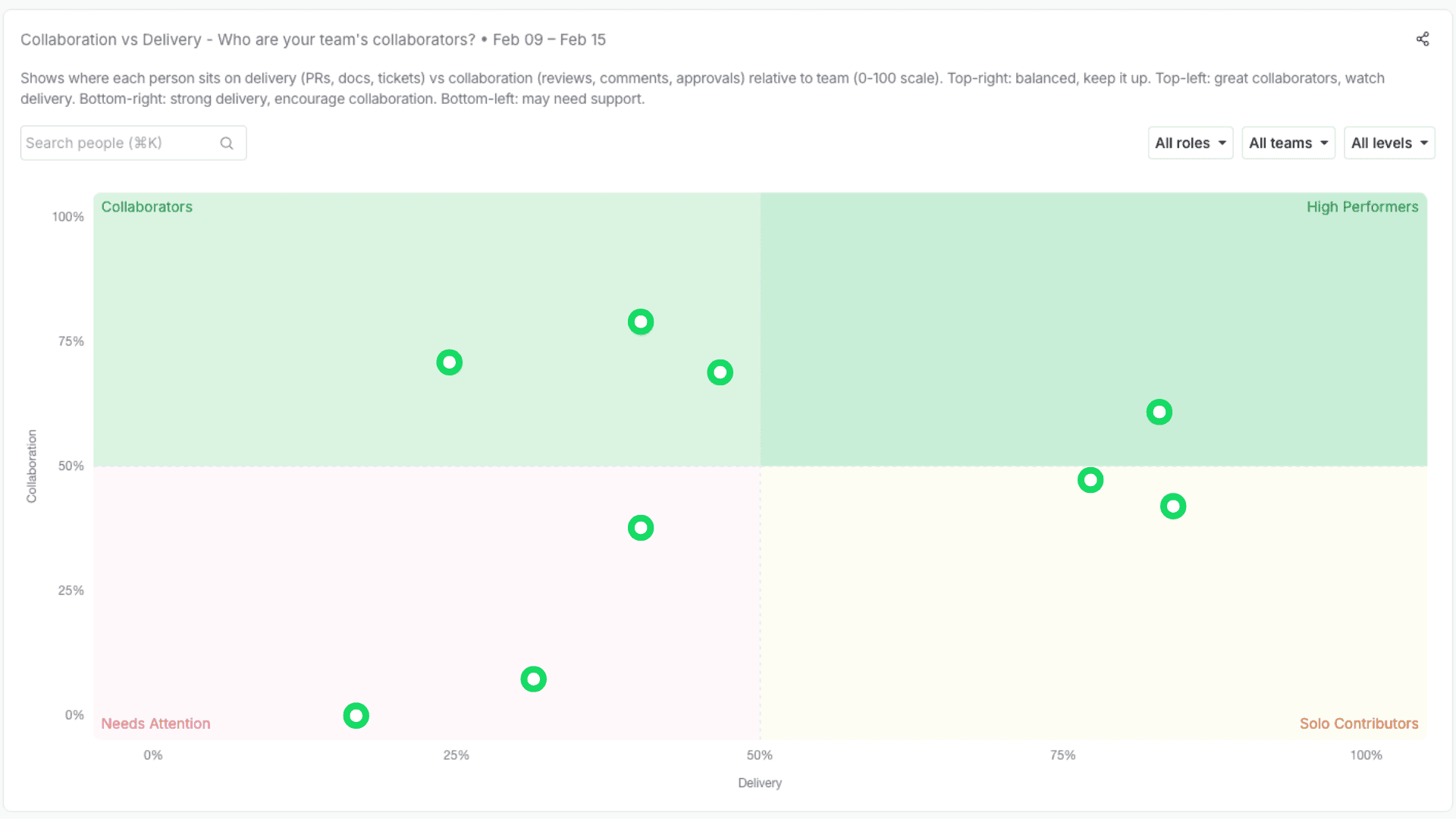
One of the most common failure modes in reviews is undervaluing enablement and leverage work: mentoring, unblocking, reviewing, design support, cross-team alignment.
So we’re building a simple quadrant that makes this visible:
X-axis: Delivery (execution signals over time, segmented by level/context)
Y-axis: Collaboration (how much you amplify others: reviews, unblocks, mentorship, cross-team support)
This helps in two ways:
it makes “glue work” legible and discussable,
it prevents the system from over-rewarding pure throughput while under-rewarding leverage.
Segmented by level, calibration can become a focused conversation on outliers and context — not a month-long narrative campaign.
3) Quality quadrants (because speed without quality is just debt)
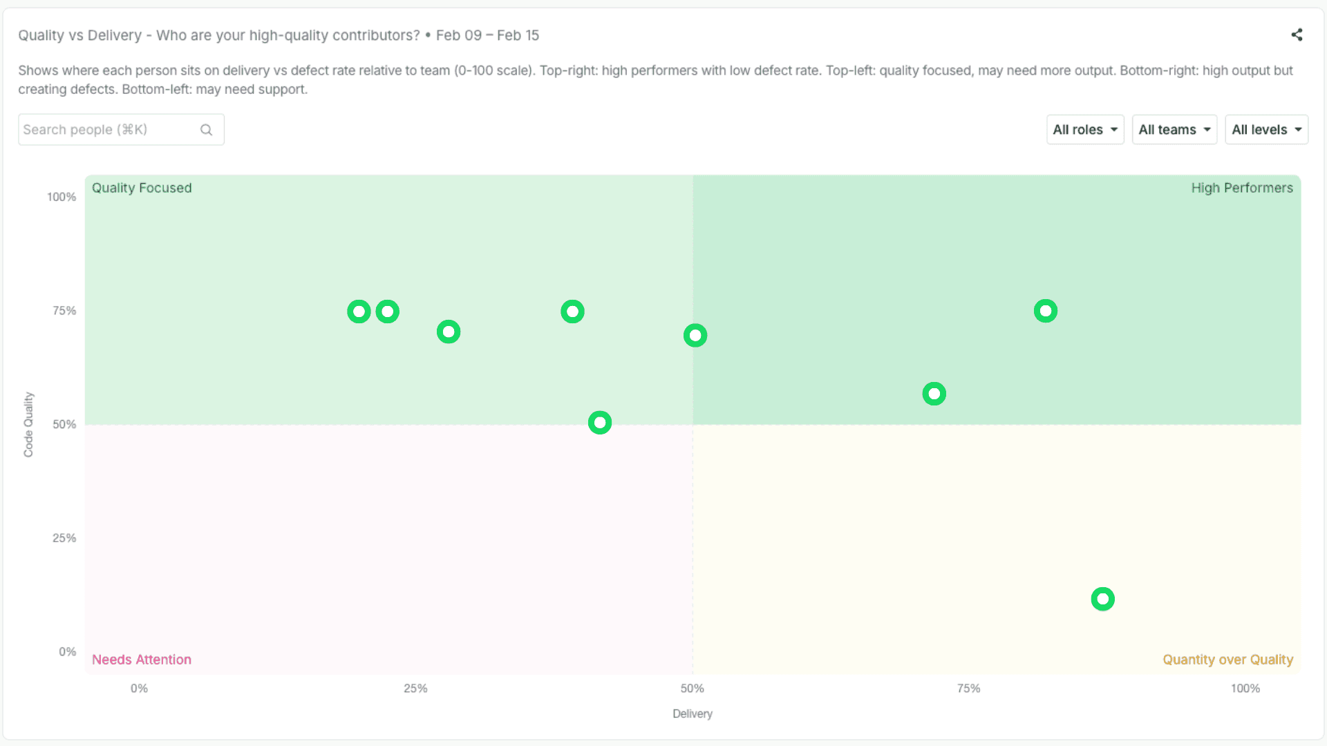
We also surface quality dimensions. Not to punish teams with hard systems, but to make trade-offs visible: rework patterns, stability signals, review depth, and reliability-related work.
The goal isn’t a single “quality score.” It’s better questions: Are we shipping sustainably? Where is risk accumulating? Who is reducing it?
4) Mapping signals to competency frameworks (what “good” actually means here)
Most companies don’t promote “high PR count.” They promote against competencies: collaboration, delivery, code/quality, communication, ownership, and system design — with different expectations by level.
So the practical move is to map contribution evidence to those competencies, for example:
Collaboration: consistent review support, cross-team contributions, unblock patterns
Delivery: sustained progress across quarters, not just end-of-cycle bursts
Code/Quality: rework reduction signals, review rigor, changes that improve maintainability
Communication: decision traceability, alignment work, clarity of technical direction
Ownership: end-to-end follow-through, reliability engagement, closing loops
System design: involvement in architectural choices and long-term shaping
This is how signals stop being “productivity scoring” and become inputs to a credible growth narrative.
5) Two concrete workflows (IC and EM)
For ICs: export your evidence → map it to level expectations → draft a self-assessment that is specific, defensible, and development-oriented.
For EMs: build fact-based snapshots per person across time, within level — plus team baselines — to reduce recency bias and improve consistency.
Outcome: calibration becomes smaller and more factual. Less debate about stories. More alignment on evidence, expectations, and growth.
The Shadow Cost
The real cost of biased metrics isn’t a wrong rating — it’s the behaviors they quietly select for.
When performance signals are shallow, people adapt in predictable ways: they optimize for what is counted, avoid what is risky, and deprioritize what is essential but invisible. Over time, that creates a silent tax on the organization:
Gaming replaces craft: work gets shaped to look good on dashboards, not to be robust.
Hard problems get avoided: risky domains and turnarounds become career hazards.
Glue work disappears: mentoring, reviews, alignment, and prevention get under-valued.
Trust erodes: ratings feel political, feedback feels arbitrary, and retention suffers.
You can’t remove subjectivity from performance. But you can reduce distortion.
Use metrics as prompts, not verdicts. Keep them auditable, contextual, and aligned with real expectations. The outcome isn’t a “perfectly fair” review cycle — it’s a safer one.
Measuring teams is hard. Measuring them wrong is dangerous.
If you’ve ever tried to understand your team through data — and felt the frustration of doing it with spreadsheets, or with tools that only rely on ticket lifecycles or member surveys, without getting a holistic and factual view — stay tuned. We’re building something for you.
And if you want to join a blue-ocean opportunity — and help shape how engineering teams navigate this new technology age — check out our careers page.
